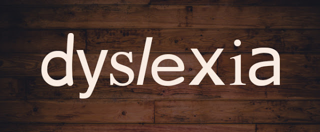
Here’s a fun font fact: people with dyslexia are better off reading text set in Helvetica rather than something like Comic Sans (well, we probably all are… but that’s another story). Helvetica, along with Courier, Arial and Verdana, all have distinct letter spacing making it easier for dyslexic readers to differentiate between characters. Read more about this and other fascinating font facts over on the Creative Market blog.
Posted in Miscellaneous


